UI Canvas
Polygon Engine scenes can contain up to eight named UI canvases. This is the preferred path for menus, HUD, prompts, progress text, and clickable buttons that ship with the game.
Use UI.DrawText() for temporary script/debug text. Use authored UI canvases
for real gameplay UI.
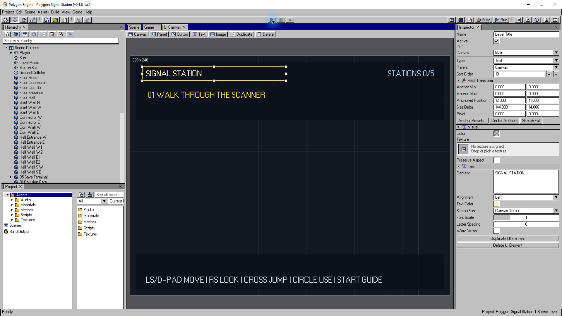
Select an element on the canvas to edit its anchors, position, size and text in the Inspector. This example uses a 320 × 240 canvas; the surrounding editor window is 1920 × 1080.
Open the image to view it at full size.Canvas Model
Every scene contains a required Main canvas with ID 0 and a default
reference size of 320 x 240. Add and configure canvases under View >
Advanced Scene Authoring > Loading & UI.
| Field | Meaning |
|---|---|
| Name | Scene-local canvas name used by the editor, Interactable, and Lua |
| Enabled | Whether the canvas is active |
| Sort Order | Canvas-level runtime draw ordering, clamped to -1024..1024 |
| Reference Width | Canvas design width, 1..4096 |
| Reference Height | Canvas design height, 1..4096 |
| Elements | Panels, Buttons, Text, Images, and ProgressBars |
| Bitmap Fonts | Up to three texture-atlas font definitions and a scene default |
The Main canvas cannot be removed. Removing another canvas moves its elements
to Main, clears their parent links, and clears Interactable Prompt Canvas
references that named the removed canvas. Renaming a canvas updates those
references.
UI element IDs remain global and stable across all canvases. Assign an element through the Canvas field in its Inspector. Moving a parent moves its subtree to that canvas; parent-child relationships cannot cross canvas boundaries.
The PS1 runtime resolves each element against its canvas reference resolution. Visible UI is drawn deterministically using canvas sort order, element sort order, hierarchy depth, and source order. Canvas visibility combines the scene UI enabled flag, the canvas enabled flag, and any temporary Interactable prompt visibility.
Element Types
| Element | Typical use |
|---|---|
| Panel | Solid backgrounds, HUD bars, grouping containers |
| Text | Labels, prompts, progress, menu text |
| Image | Logos, icons, authored texture elements |
| Button | Selectable menu actions with navigation and script callbacks |
| ProgressBar | Horizontal or vertical bounded 0.0..1.0 HUD value |
Elements can be parented to other UI elements. Parent visibility affects child visibility at runtime.
Common Properties
| Property | Applies to | Description |
|---|---|---|
| Name | All | Stable name used by Lua lookup |
| Enabled | All | Runtime visibility |
| Rect Transform | All | Position and size relative to parent/canvas |
| Sort Order | All | Draw order |
| Color | Panel, Button, Image | Fill or tint color |
| Texture GUID | Image, textured elements | Imported texture reference |
| Text | Text, Button | Displayed string |
| Text Color | Text, Button | Text color |
| Text Align | Text, Button | Left, center, or right |
| Interactable | Button | Allows focus and activation |
| Navigation | Button | Explicit or automatic focus movement |
| On Click | Button | Lua function call target |
| Bitmap Font | Text, Button | Scene font name, integer scale 1..4, letter spacing, and word wrap |
| Progress Value | ProgressBar | Filled fraction, clamped to 0.0..1.0 |
| Progress Fill Color | ProgressBar | Filled-region color |
| Vertical | ProgressBar | Fill bottom-to-top instead of left-to-right |
Bitmap Fonts
Define bitmap fonts in Advanced Scene Authoring > Loading & UI. A font
references an imported texture atlas and declares glyph width/height, first
byte character, glyph count, atlas columns, letter spacing, and line spacing.
The declared grid requires
glyphWidth * columns by
glyphHeight * ceil(glyphCount / columns) pixels. It must remain within the
PS1 256 x 256 texture dimension and fit inside the atlas's actual imported
output dimensions.
Build validation checks this imported width and height for every scene in Build Settings, not only the active scene. Reimport an atlas when its imported dimension metadata is missing or stale; a build fails if the declared glyph grid does not fit the imported texture.
Set a scene default or override the font on individual Text/Button elements.
Font scale is restricted to whole-number sprite scaling from 1 through 4.
The PS1 runtime aligns each rendered line left, center, or right within the
element rectangle. With Word Wrap enabled, it wraps at the last available
space and falls back to a character boundary when a single word is wider than
the line.
When no authored font resolves, runtime text falls back to the built-in path. Bitmap fonts are fixed-grid byte-character atlases, not vector fonts or a dynamic Unicode shaping system.
Runtime Scripting
Lua can control authored UI with the UI module:
local promptId = -1
local healthId = -1
local hudCanvas = -1

function Start(gameObjectId)
    hudCanvas = Canvas.Find("HUD")
    promptId = UI.Find("Prompt Text")
    healthId = UI.Find("Health")
    Canvas.SetEnabled(hudCanvas, true)
    Text.SetText(promptId, "Press Cross")
    Graphic.SetEnabled(promptId, true)
    ProgressBar.SetValue(healthId, 1.0)
end

function Update(gameObjectId, dt)
    if Input.GetButtonDown(Input.CROSS) then
        Text.SetText(promptId, "Activated")
    end
end
ProgressBar.SetValue(elementId, value) clamps the value to 0.0..1.0 and returns
false when the element id does not exist.
Canvas functions are:
Canvas.Find(name)returns a canvas ID or-1;Canvas.SetEnabled(canvasId, enabled)returns a boolean;Canvas.IsEnabled(canvasId)returnsfalsefor a missing ID;Canvas.SetSortOrder(canvasId, sortOrder)clamps to-1024..1024;Canvas.GetCount()returns the active scene's authored canvas count.
For the full API, see Scripting: UI.
Button Callbacks
A Button can call a Lua function through its On Click settings. The build validation checks whether the referenced script function exists when it can resolve the target.
Keep button callbacks small. Use them to load scenes, update save state, change focus, or call a gameplay function.
PS1 Limits
The current runtime has fixed budgets of eight UI canvases, 32 UI elements across those canvases, and three bitmap fonts per scene. Keep UI simple:
- reuse panels,
- prefer short text,
- avoid unnecessary nested elements,
- keep texture-backed UI elements small,
- validate the scene before building.
The First Person Tour uses authored UI for the main menu, hub buttons, in-level prompts, progress text, and save/load feedback.